Your agents just learned data visualization
Gobii agents can turn collected data into charts for emails, reports, PDFs, recruiting workflows, sales research, and operations tracking.
Gobii agents can now generate charts directly from the data they collect.
That matters because many agent workflows do more than gather information. They track prices, compare candidates, score leads, monitor competitors, and build up useful structured data over time. Until now, turning that data into a useful visual usually meant exporting it somewhere else first.
Embedded Charts remove that extra step. An agent can query its internal database, turn the result into a chart, and include that chart in the same email, report, or PDF it was already going to send.
Why This Matters
Agents are most useful when they can keep context over time. A recruiting agent that reviews candidates every day should be able to show pipeline trends. A pricing monitor should be able to show movement across competitors. A sales research agent should be able to summarize lead quality instead of handing you a pile of rows.
Charts make that work easier to scan. They also make agent output more useful for people who were not part of the original task, because the pattern is visible immediately.
How It Works
Every piece of structured data your agent collects can live in its internal database: scraped prices, candidate scores, lead metrics, task history, and more. Embedded Charts turn that stored data into visuals through a simple flow.
- The agent collects data from the web, email, files, or other connected sources.
- It uses SQL to shape the data into the view the task needs.
- It generates a bar, line, pie, scatter, or area chart.
- It embeds the chart directly into an email, report, or PDF.
No separate export. No spreadsheet cleanup. No manual chart-building step.
What You Can Build
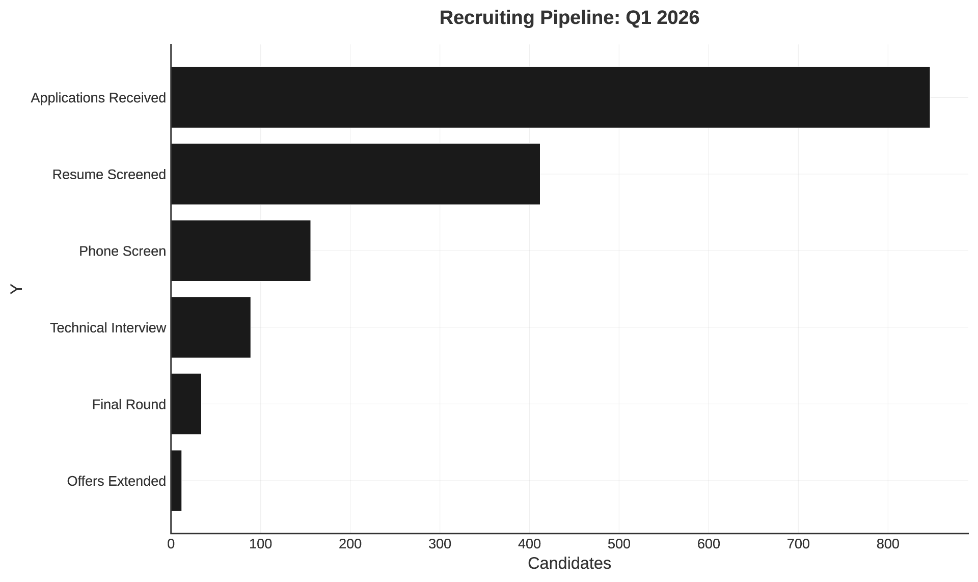
Recruiting
- Funnel views of candidate pipeline stages.
- Score distributions across applicants.
- Time-to-hire trends by role.
Sales And Lead Generation
- Lead scoring distributions.
- Conversion rate trends over time.
- Outreach response comparisons by segment.
Market Research
- Competitor pricing comparisons.
- Feature coverage matrices.
- Market share breakdowns by segment.
Operations
- Task completion trends.
- Error rate dashboards.
- Resource utilization over time.
The best part is that the chart arrives where the work already happens. If your agent is sending a weekly report, the visualization can be part of that report automatically.